![Dark mode | Dark UI design - best practices, tips, resources [2025 Edition] | (1) dark ui design - best practices](https://nighteye.app/wp-content/uploads/2022/05/dark-ui-design-best-practices-1200x480.jpg)
Intro into the Dark UI design
YouTube has dark mode so do Twitter, Facebook, Linkedin, Google, and countless other apps. But is Dark UI the right thing for your app, what are the best practices and tips when it comes to implementing dark mode?
What is dark mode?
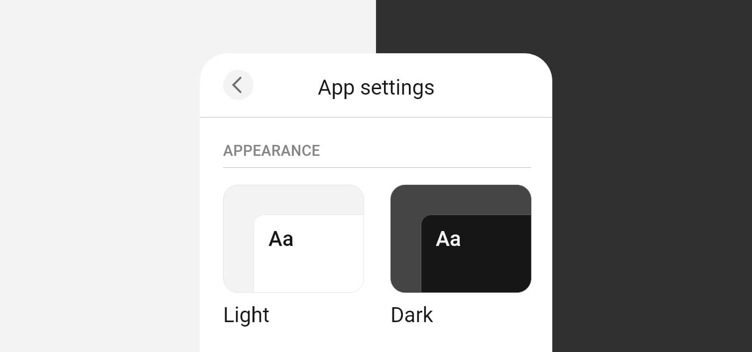
Although the dark UI trend is becoming ever more popular in recent years, it is not new. It is a predominately dark color UI. Darker colors are used for the background and large page elements, while lighter colors are used for text and text elements.
What dark mode is NOT?
Dark mode does not mean black mode. It is NOT a black background and white text.
Google’s Material Design dark theme recommends using dark gray (#121212) as a dark theme surface color “to express elevation and space in an environment with a wider range of depth.”
You need to steer clear of pure black as it is hard on the eyes.
Also, dark mode does not mean color inversion. This is what most of the dark mode extensions are doing - inverting the colors. Not only does it look weird, but you are also turning colors that had a psychological purpose into meaningless ones.
Example of a poor dark mode - LinkedIn
One recent example of a really poor dark mode execution is the dark mode introduced by LinkedIn in late 2021. This is not what dark mode is supposed to be.
Example of a great dark mode - Twitter
Twitter was one of the first big tech companies to introduce dark mode to their platform. The design went through several changes, but what is important here is that it is very well designed.
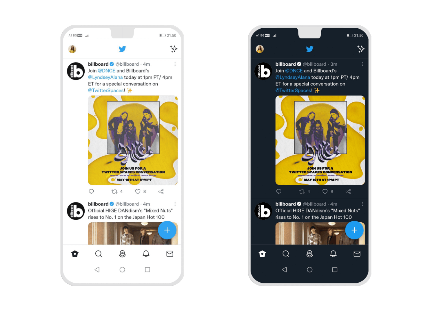
A comparison of light and dark mode on Twitter
When the Dark UI design can be a problem
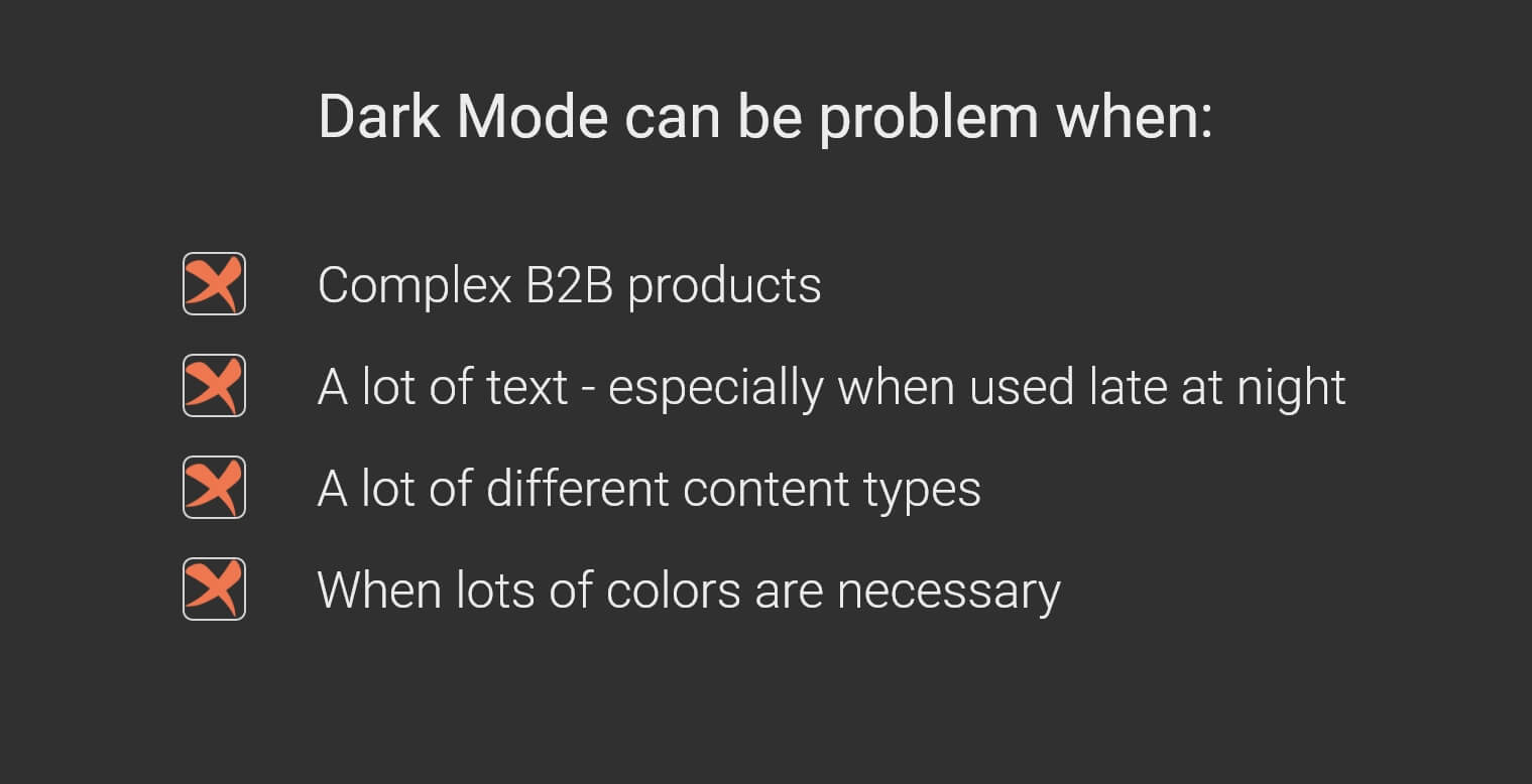
A serious red light that going “to the dark side” might not be a good idea is usually one of those:
- Not all interfaces are suitable for dark theme. It depends on your target audience. Complex B2B products are nearly impossible to have a great dark UI.
- A lot of text. Light text on a dark background can be beneficial only if you are designing a book app. In any other case when you have a lot of text, especially if your website/app will not be used late at night, it is not recommended approach.
- A lot of different content types
- When it is necessary to have a lot of colors. In other words, when having a minimalist design is not an option.
When Dark Mode is the right choice?
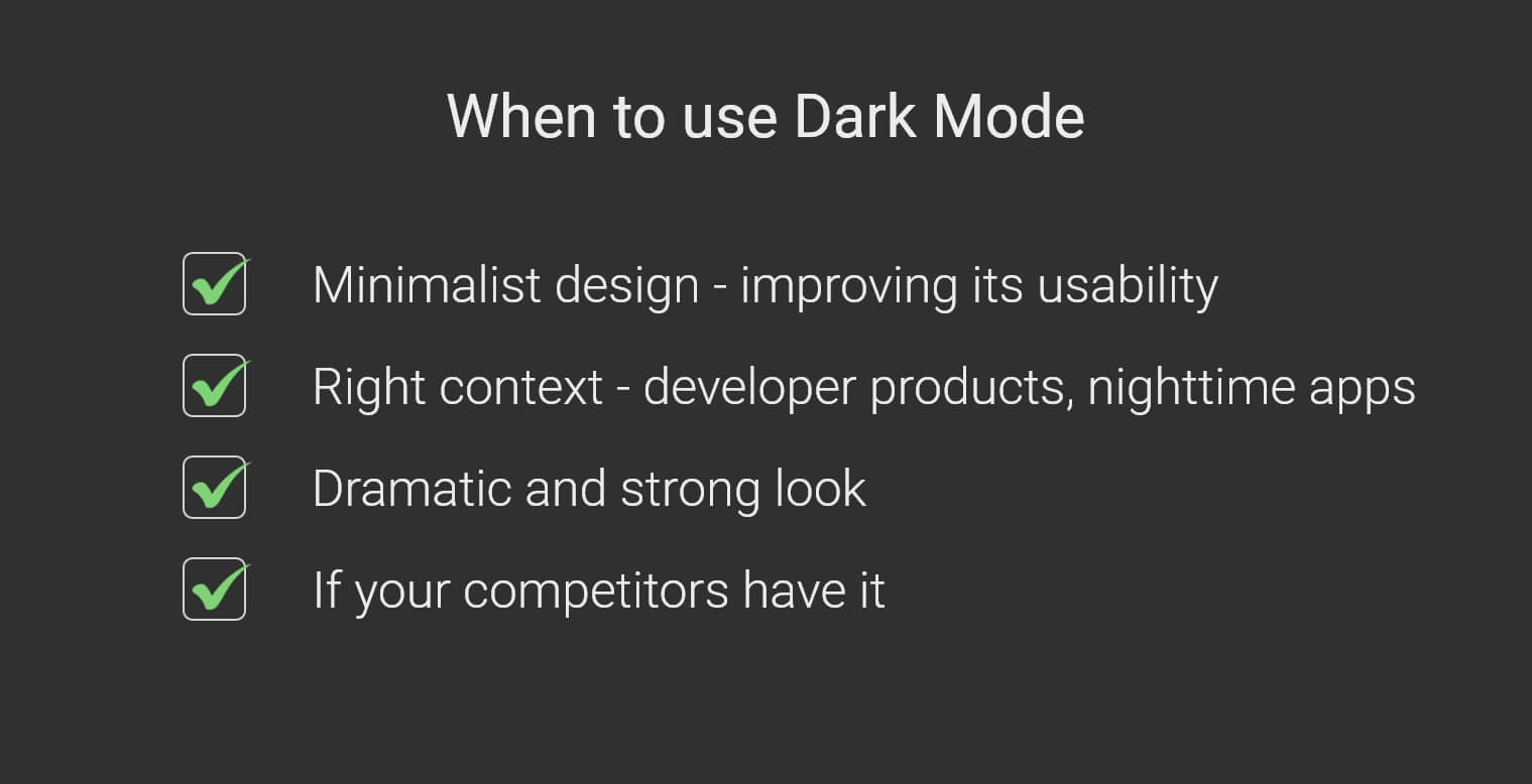
- Minimalist design with few content types.
- Dark mode nowadays can be viewed as a synonym of minimalism. If your product/website is leaning towards the minimalist approach - dark mode can supplement and improve its usability of it.
- When the context is right
- If you are designing developer products, nighttime entertainment apps, or apps that are being used mostly at night - go for it.
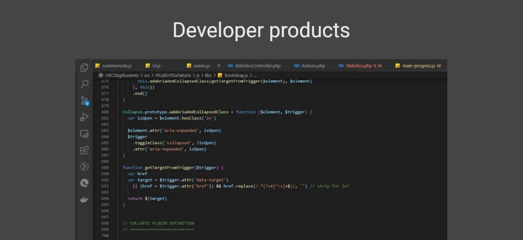
- To create dramatic and strong look
- If your competitors have it
- Usually, that’s a sign of the dark mode being validated with your target audience. If it is accepted well, you might consider adding it as well. Although this is the weakest argument in favor of dark mode, it is still worth considering.
Best practices when designing dark UI
The colors
Avoid saturated colors. Use low saturation or slightly muted versions of your primary colors. Desaturated colors in combination with dark (again, not black) backgrounds create a visually appealing and more importantly easy on the eyes UI.
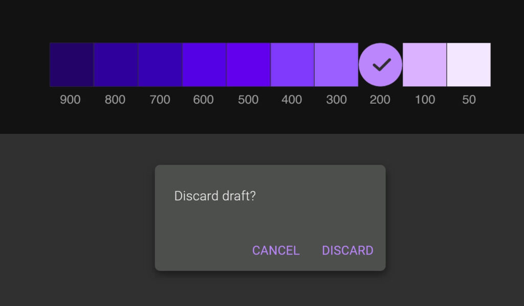
Color saturation and primary color selection (900-50 are tonal variations). (Source: Material Design)
The general look
Avoid crammed interfaces. Illustrations, buttons, different content types, and other design elements can quickly overcrowd the screen. Stick with the minimalist approach and make sure your creation is easily scannable to improve the user experience. To put it differently - make sure there is enough “white space” (not literally white, of course) so that it doesn't feel cluttered.
The Typography
Since small text on a dark background is harder to read, consider a large enough font size for good legibility
Make sure there is enough contrast between the text and the background.
The depth
Why depth in the first place? It is used to create a visual hierarchy of an interface. In light mode, illumination, shading, and shadows are mostly used to create that sense of depth. In dark mode, those tools of the craft don't apply and you need to avoid them.
One of the key instruments to create depth in dark mode is to use brighter colors closer to the user's objects.
A key thing to remember here is that you need to limit your color levels up to 4 or 5.
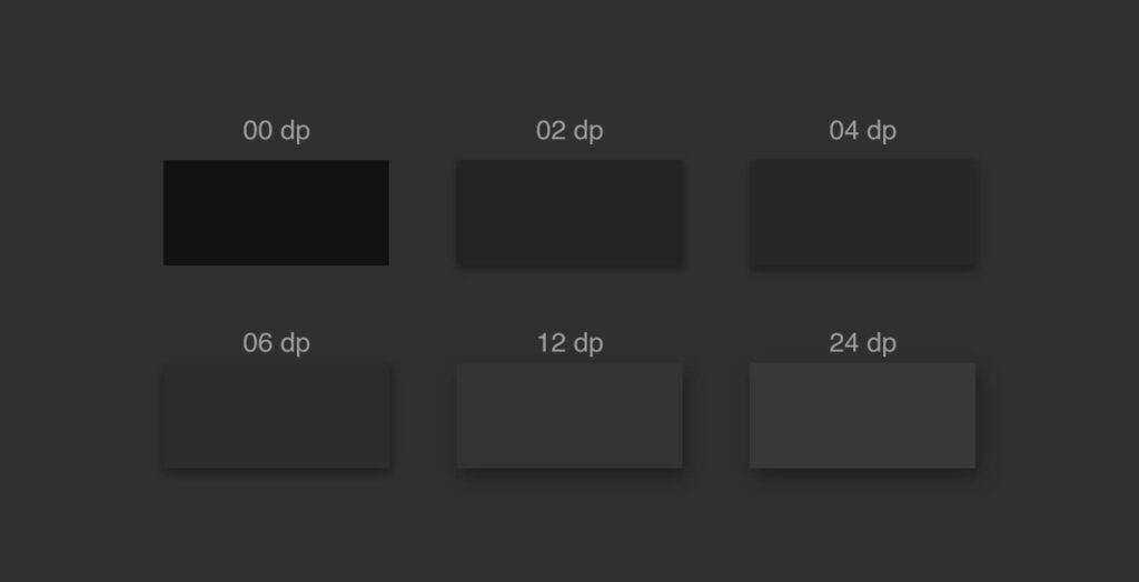
Elevation principles formulated by Material Design
Let the user decide
As stunning as it might look the end result, make sure to include a toggle to allow users to switch between light and dark mode.

Useful resources
- Night Eye WordPress plugin - enables smooth dark mode on your WordPress website
- Dark CSS Generator - enter your website and the generator will allow you to download a CSS with dark mode
- Material dark theme guidelines.
- Dark mode UI inspiration in Dribbble
- Figma tokens — a plugin to help customize and adapt your design system to multiple themes.
- Contrast — a plugin to help check the contrast ratio of background and foreground elements.
Key takeways
The decision to go for dark instead of light UI, although seems simple, can be really detrimental. Make sure you consider all the important factors and more importantly understand when dark mode can be beneficial, and when it can hurt the overall performance of the product you are designing. Don't follow the trend blindly, make sure your decision is fact-based, and not emotional.
The key thing to understand is that Dark themes are not suitable for all products. A critical element of the dark theme is its simplicity. If you are looking to present minimalist content, data visualizations, media sites, and entertainment platforms - a dark theme is the way. If you are in charge of designing complex, data-rich platforms, and pages with a lot of text - think again.

![Dark UI design – best practices, tips, resources [2025 Edition]](https://nighteye.app/wp-content/themes/betheme/images/cookies.png)