Does Github have dark mode?
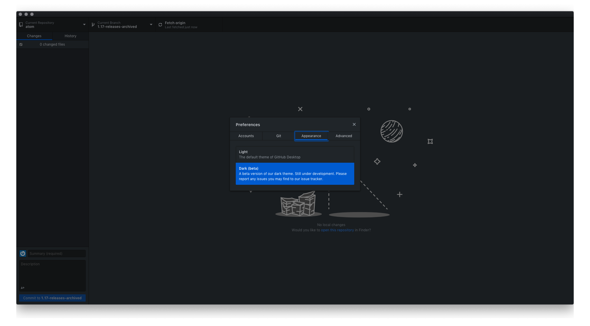
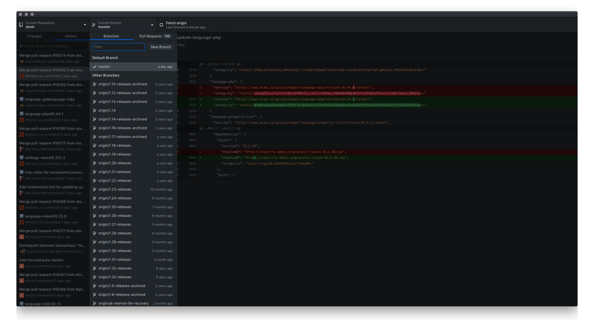
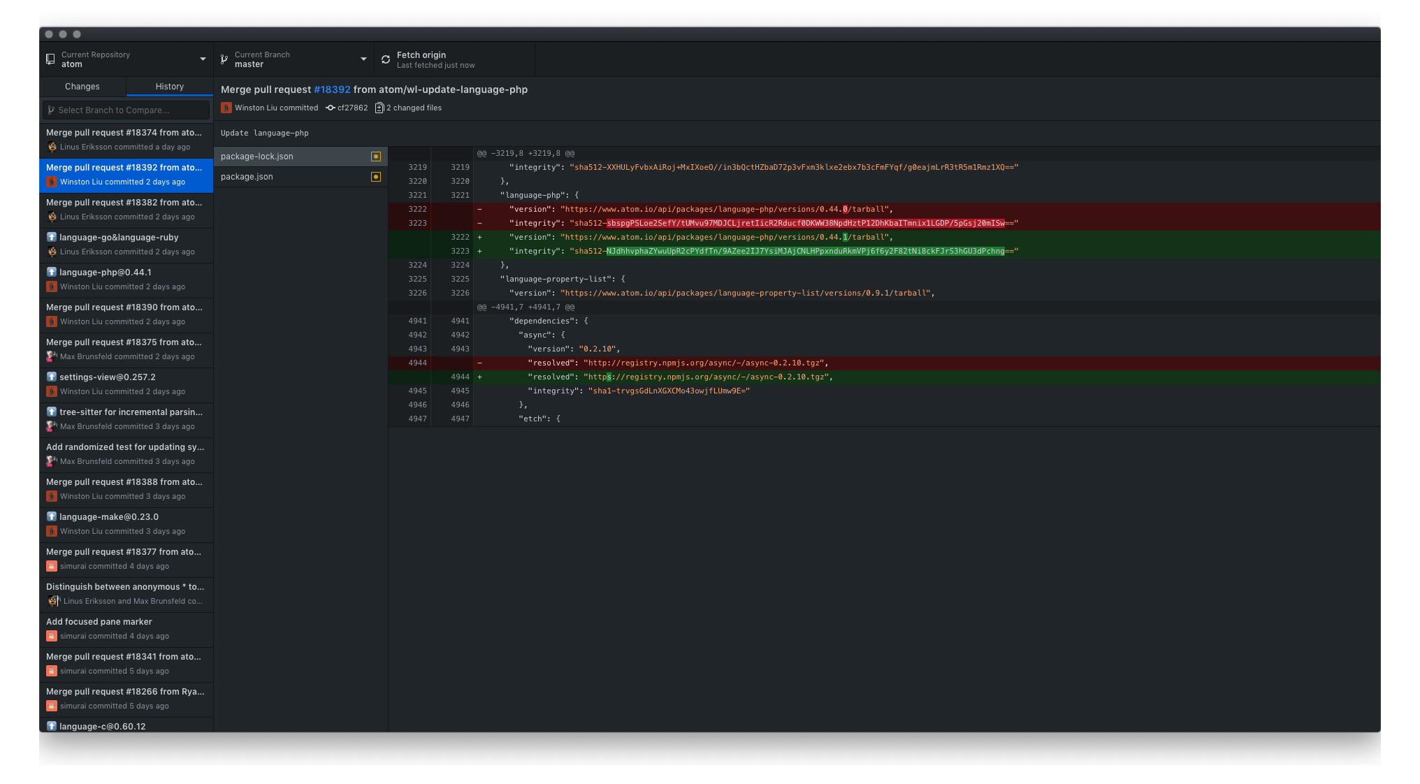
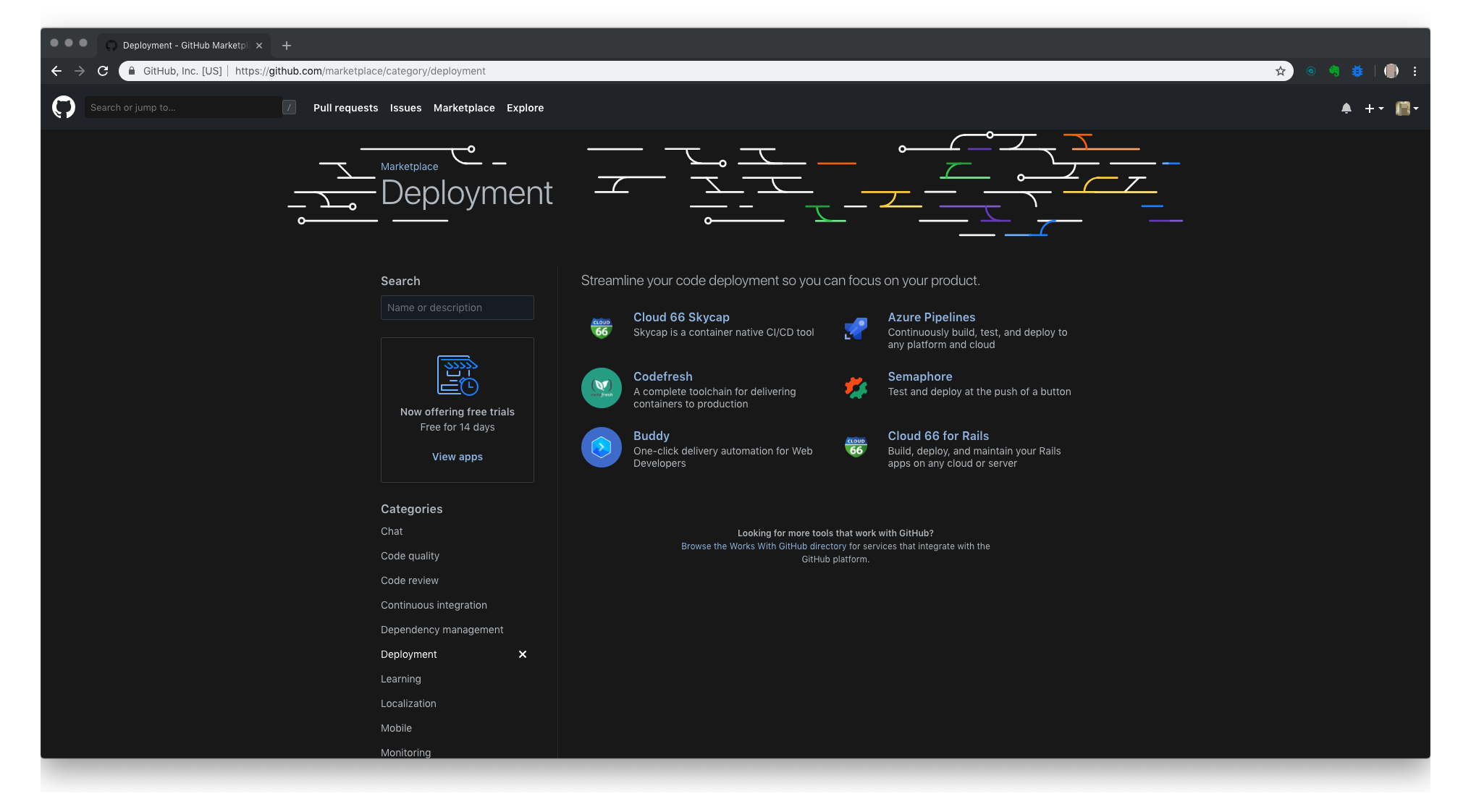
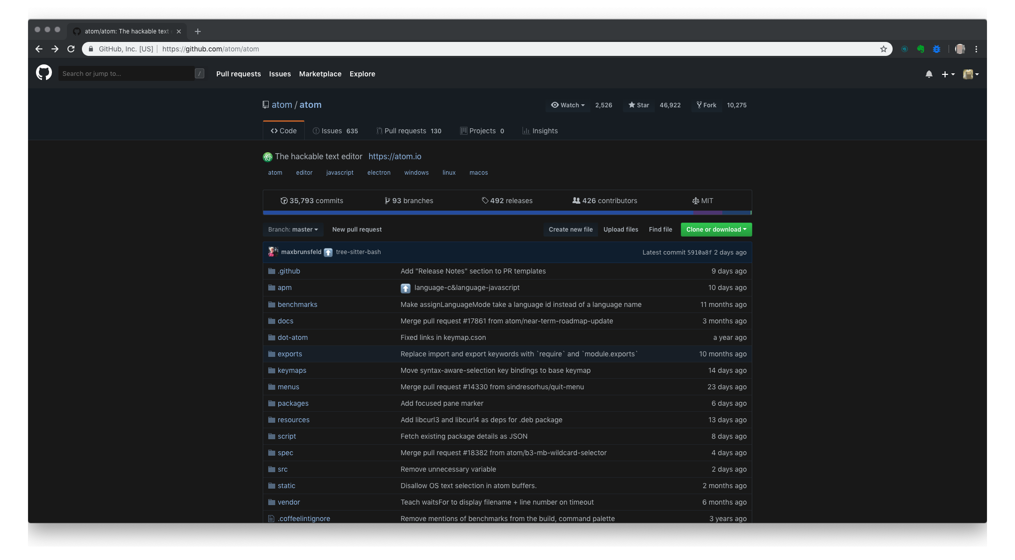
Recently Github has launched dark mode feature for its desktop version which is still in its early stage. It is labeled as beta version which means that there could be some glitches but it. In general, it is awesome, but if you find any issues, simply report it.Here are few snapshots to give you a sense...
The website GitHub.com, though, does not offer dark mode. If you prefer not to use the desktop version, you can either stick with the bright white screen or use an external solution.
But why would you prefer dark mode on github.com and why developers in general prefer dark mode?
Nearly 70% of software engineers have set dark UI on their IDE’s. Although such number cannot be verified by substantial research (reference here), it seems that the number is close to being real. There are several positive effects of dark themes that cannot be ignored.
1. You can maintain focus for longer time when reading/working with dark mode enabled.
2. Dark UI minimises the “digital eye strain”. A term, nowadays, used when referring to a common condition that affects quite a lot of people around the world. It is caused in most cases by extreme exposure to screens and excessive use of computers, smartphones, TVs and etc. Its symptoms are headaches, blurred vision and blurred eyes.
3. If the your IDE’s is all dark, switching to GitHub.com/stackoverflow.com can be real painful.
One can argue that if you are a not full-time developer, but only a hobbyist, you don’t need to set up all dark since you won’t be spending too much time coding. However, the digital eye strain is not caused only by coding alone, but rather by starring at screens. Even if you work in sales from 9 to 5 and code for fun after work, you are still starring at screens for 10-14 hours a day. Which is a lot. Thus regardless if you are a senior, junior or hobby developer, the dark theme can be really beneficial for your health and focus.
What can you expect from using Night Eye dark mode on GitHub
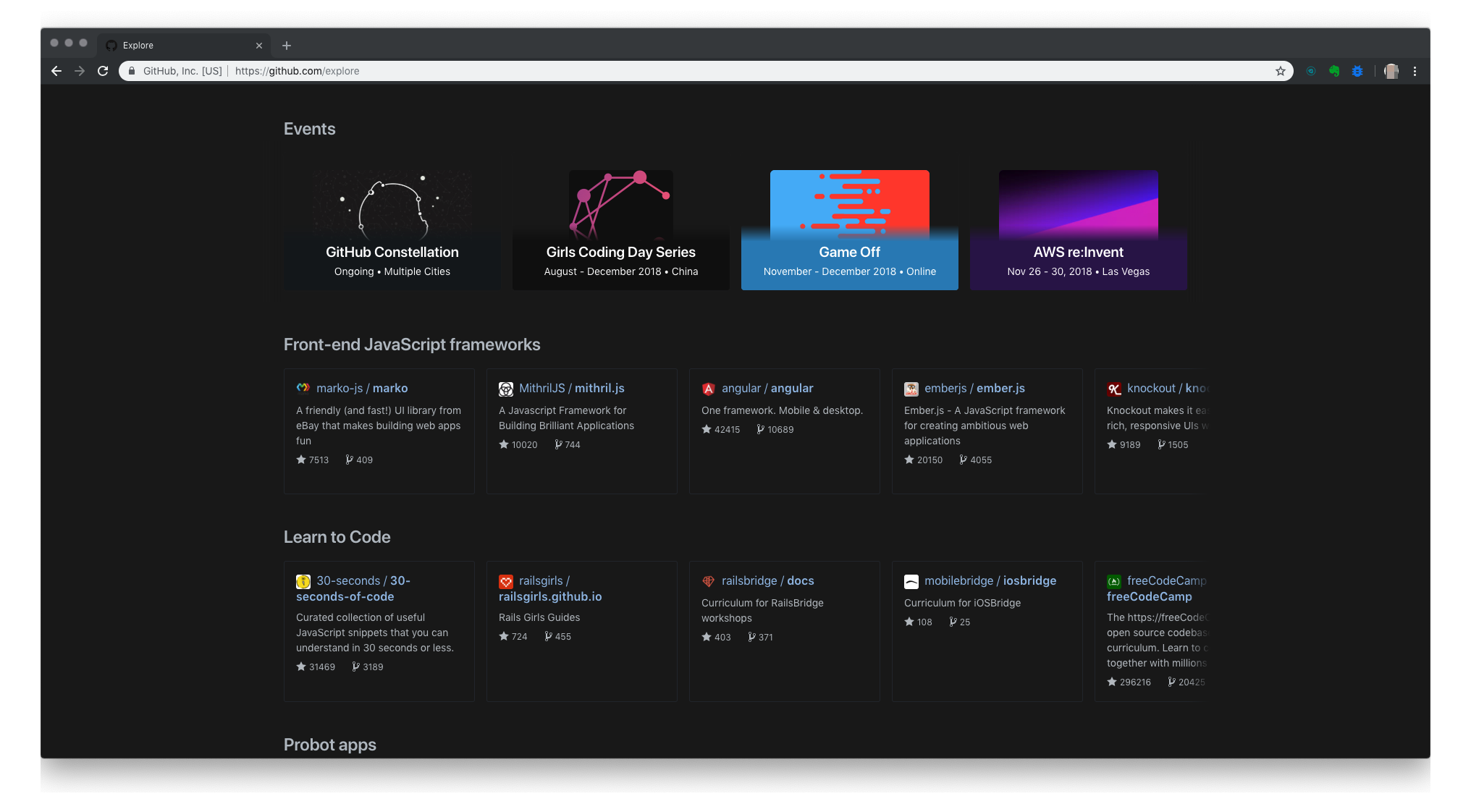
Here are few snapshots on how would it look like if you install it. Night Eye works not only on Github.com, but on nearly any website you can imagine.
Start your 3 months Free Pro Trial and enable a smooth dark mode with Night Eye

