For thousands of digital professionals, content creators, consultants, lawyers, and freelancers, time tracking is an essential part of their work. It is a tool that sits in the background, helping you remain organized to manage time, projects, tasks, reports, and your calendar. But there comes a time when you want a consistent workspace theme across all opened websites and tasks.
Or perhaps, you wish there were at least a color choice button to toggle on/off light or dark mode. Fortunately, you can still activate Toggl Dark Mode with heightened flexibility to personalize your workspace environment. This guide will show you everything you need to know about enabling dark mode on Toggl.

Dark Mode: A Modern User Interface Trend
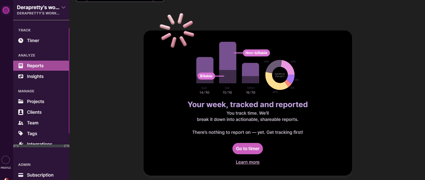
Dark mode is like a breath of fresh air for your tired eyes and a great upgrade to your Toggl Track dashboard. Think of it as a warm coat after hours spent outside in the rain or storm. With just the right amount of darkness and shadows, it offers soothing comfort to your eyes, enabling you to work in total calm if you prefer.
At its core, it’s not just about darker colors, but a dark environment (or background), a muted color palette, and light-colored text. The result is a striking and amazing user interface where colors and elements stand out, thereby giving off an air of mystery and luxury and offering a more immersive experience. Dark mode offers a combination of style and functionality and is therefore a must-have feature. It’s no wonder developers and designers have been working primarily in dark mode for ages.
Why Does Dark Mode on Toggl enhance Productivity?
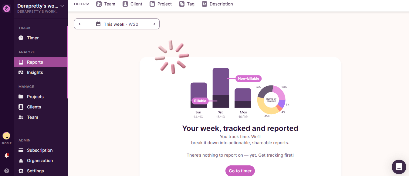
Your toggl dashboard comes with a lot of features, creating a customizable, informative environment where you can manage everything. This also means you will spend a lot of time here creating your invoices, batch-working to the Pomodoro timer, and lots more. But then, working on Toggl’s default bright background can become painful to the eyes after a while. Although the default theme seems to be a dark shade, the harsh white backlight and blue light emissions will become taxing on your eyes after long hours.
Using dark mode on Toggl will enable you to turn off the lights whenever you wish to do so without losing progress in your work. You will find that dark mode tends to relieve strain and stress on the eyes, by minimizing overall screen brightness, and reducing blue light filters. With Toggl's dark mode, you can work for longer periods in an eye-friendly environment.
The lower contrast between your surrounding environment and the screen will make it easier on your eyes and reduce visual fatigue, thereby further supercharging your work.
Additionally, you will love using Toggl dark mode when it’s time to balance your timesheet because dark mode tends to highlight the content before you while minimizing visual noise. What this means is that every other visual element would seem to fade into the background bringing your focus to your manual and automatic time tracking sheets so you can accurately adjust your billable hours with the ultimate focus. Hence, dark mode helps create a serene work environment that centers your attention on what matters: your tasks and managing time.
The dark mode also tends to enhance the readability of text due to the higher contrast between text and background. So this further makes it easier to focus on the content before you without distractions.
Together, the reduced strain on the eyes, increased readability, minimal distractions, and even battery-saving potential will drive up your focus and productivity profoundly.
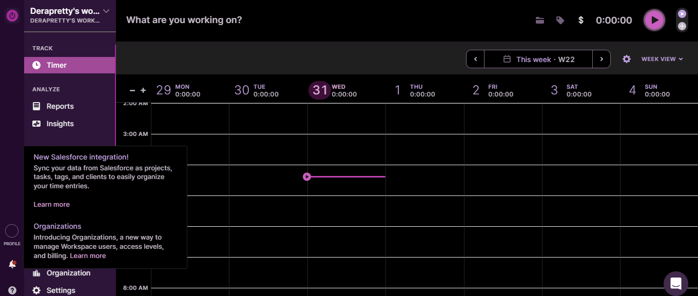
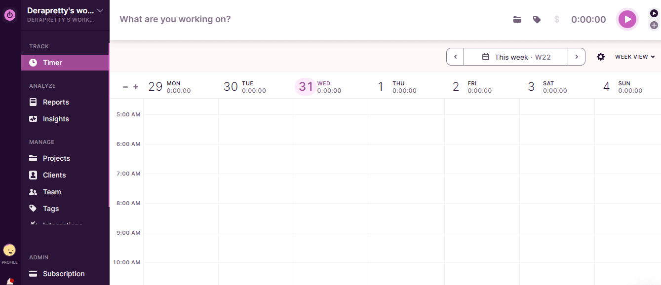

Step-by-Step Instructions: Activating Dark Mode on Toggl with Night Eye
Unlike most dark mode browser extensions, Night Eye does not simply invert colors and images. Instead, it carefully coats the default white theme of your Toggl dashboard, creating a delightfully elegant and sleek background.
You will also love that Night Eye is compatible with most popular browsers. Here’s how you can activate Toggl dark mode using Night Eye.
- At the end of this article, you’ll find icons for selecting your browser type
- Selecting that option brings you to the Night Eye browser extension page
- Now click on “Add” and Night Eye adds automatically to your browser and begins automatically changing any open websites and webpages
- Even more, you can click on Night Eye’s icon (little eye icon) in the toolbar to turn on/off the dark mode as well as adjust brightness, dim filters, color filters, and more.
- Enjoy an improved time-tracking experience with Toggl’s elegant dark theme.
Conclusion
Whether you are checking off tasks on your to-do list or organizing your calendar to be able to control and manage your time, having your tools spread out in your preferred theme can be just the thing. That’s why Toggl Dark Mode by Night Eye is a fantastic option to enjoy a consistent dark theme whenever you wish for that complete transition to the dark. With Toggl Dark Mode, you can work smarter, remain focused, and make tracking time a fascinating experience. So go ahead and activate Toggl’s dark mode with Night Eye today. It is a surefire way to supercharge your productivity and time management, even in the darkest hours.


